Input
 Edit on GitHub
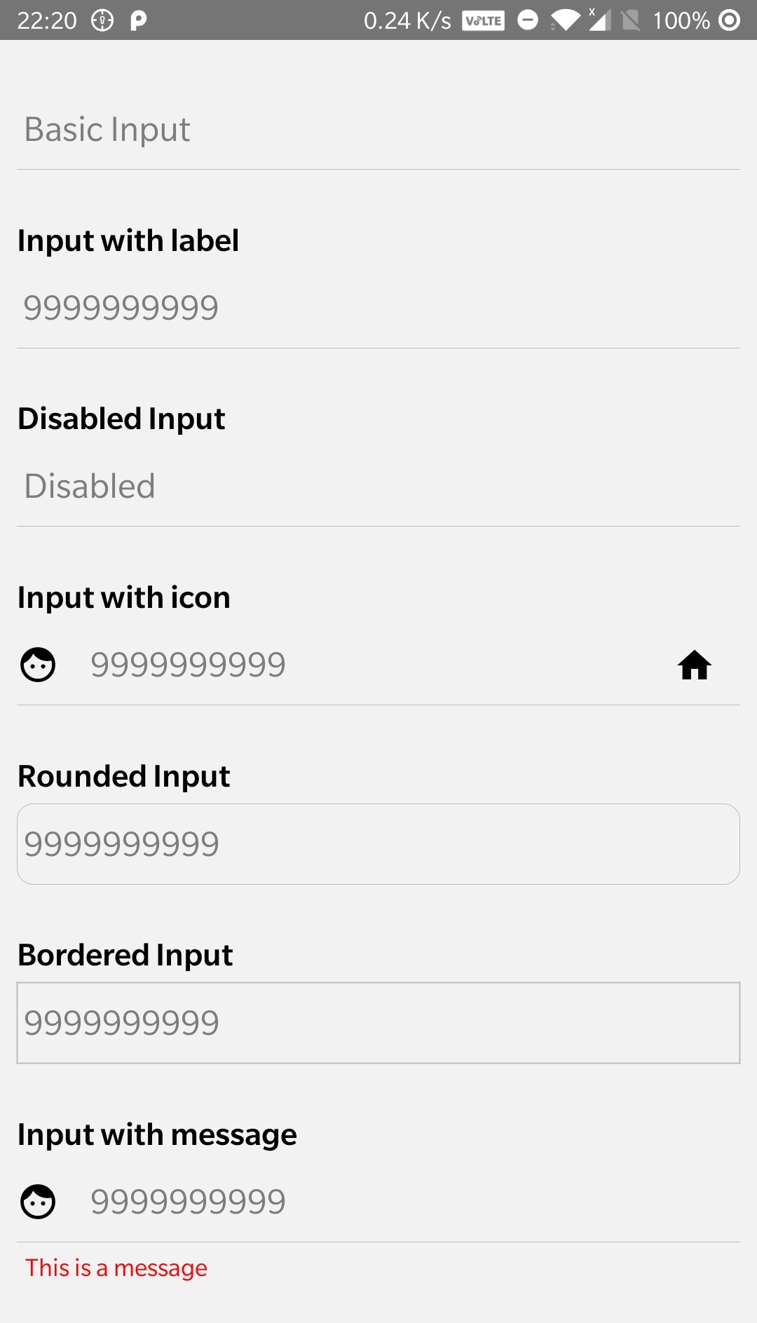
The Input component can be used to input text.
Usage
import {Input} from "react-native-lights";const InputComponent = () => {return (<Inputplaceholder="9999999999"placeholderTextColor="#7d7d7d"autoFocus={true}maxLength={10}keyboardType={"numeric"}leftInputIcon={<Iconname="face"size={25}// color="white"style={{ marginRight: 15 }}/>}/>);};
Props
| Namelabel | Typestring | default- | descriptionLabel for the Text Input. |
| Nameappearance | Typestring | defaultunderlined | descriptionCan be underlined, bordered or rounded. |
| Namemessage | Typestring | default - | descriptionCan be used to display text under the input. |
| NameleftInputIcon | TypeImage Component | defaultnormal | descriptionCan be used to display an icon to the left of input. |
| NamerightInputIcon | TypeImage Component | defaultnormal | descriptionCan be used to display an icon to the right of input. |
| NamemessageIcon | TypeImage Component | defaultnormal | descriptionCan be used to display an icon next to the input message. |
| NameinputContainerStyle | TypeView Component style | defaultnormal | descriptionStyles for the message container. |
| Namestyle | TypeTextInput Component style | defaultnormal | descriptionStyles for the TextInput component. |
| Namedisabled | Typeboolean | defaultfalse | descriptionCan be used to show disabled input. |
| Name...TextInputProps | TypeTextInputProps | default - | descriptionAny props of TextInput component. |