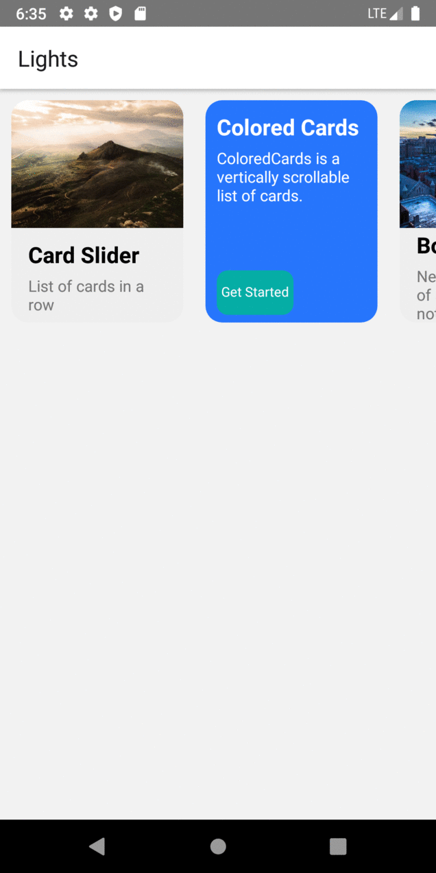
Card Slider
 Edit on GitHub
Highly configurable card slider.
Usage
import {CardSlider} from "react-native-lights";const CardComponent = () => {const cardItems = [{title: 'Card 1 ',description: 'Include images to your card',buttonTitle: 'Get Started',backgroundImage: {uri:'https://i.imgur.com/2nCt3Sbl.jpg'},buttonFunction: function(){Alert.alert("Thank You", "for choosing Lights!", [{text:"Welcome"}])}},{title: 'Card 2',description: 'You can choose to just have background color',buttonTitle: 'Get Started',backgroundColor: 'black',},{title: 'Card 3 ',description: 'onPress function is tagged to the image.',buttonTitle: 'Get Started',backgroundImage: {uri:'https://i.imgur.com/2nCt3Sbl.jpg'},buttonFunction: function(){Alert.alert("Thank You", "for choosing Lights!", [{text:"Welcome"}])}},{title: 'Card 4',description: 'Lorem ipsum dolor sit amet et nuncat mergitur',buttonTitle: 'Get Started',backgroundImage:{uri:'https://i.imgur.com/KZsmUi2l.jpg'},},];return (<CardSlider data={cardItems} />)}
| NamebackgroundImage | Typeimage URL | default- | descriptionFont size of the text in the Button |
| NamecardBorderRadius | Typeint | default15 | descriptionBorder radius of the respective card |
| NamecardHeight | Typeint | default200 | descriptionHeight of the card |
| NamecardWidth | Typeint | default155 | descriptionrespective card width |
| NamebuttonFunction | Typefunction | default- | descriptionFunction for the respective card button |
| NamecardPadding | Typeint | default10 | descriptionpadding of the respective card |
| NamecardHeaderJustifyContent | Typestring | defaultflex-start | description Title content justification along the height |
| NamecardHeaderAlignItem | Typestring | defaultflex-start | description Title content align along the width |
| NameprimaryTextColor | Typestring | defaultblack | description Title text Color |
| NameprimaryTextSize | Typeint | default20 | descriptionTitle text Size |
| Nametitle | Typestring | default- | descriptionCard title |
| NamecardBodyHeight | Typeint | default100 | descriptionHeight of the description container(Card Body) |
| Name cardBackground | Typestring | default#2675FC | descriptionBackground color of the card |
| Name cardMargin(background image cards) | Typeint | default10 | descriptionSet the card margin if you include image as a background image |
| NamecardBodyAlignItem | Typeint | defaultflex-start | descriptionAlign the content in the description container along the width |
| NamecardBodyJustifyContent | Typeint | defaultflex-start | descriptionjustify the content in the description container along the height |
| NamesecondaryTextColor | Typestring | default#777 | description Title text Color |
| NamesecondaryTextMargin | Typeint | default5 | descriptionMargin for the description content |
| Namedescription | Typestring | default | descriptionCard description |
| NamebuttonWidth | Typestring in percentage | default70% | description Button Width |
| NamebuttonHeight | Typeint | default40 | description Button height |
| NamebuttonTop | Typeint | default14 | description Top value for the respective button |
| NamebuttonBackground | Typestring | default#05ada5 | description Button Background |
| NamebuttonBorderRadius | Typeint | default10 | description Button Radius |
| NamebuttonPadding | Typeint | default4 | description Padding for Button |
| NamebuttonTextColor | Typesting | defaultwhite | description button Text Color |
| NamebuttonTextAlign | Typesting | defaultcenter | descriptionAlign text within button |
| NamebuttonTextTop | Typeint | default7 | descriptionSet Top value for the text within the button |
| NamebuttonTextSize | Typeint | default12 | descriptionFont size of the text in the Button |