Colored Cards
 Edit on GitHub
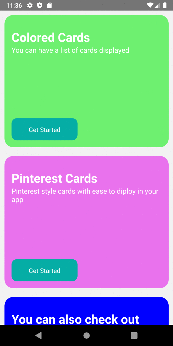
List of colored Cards that can be configured to fit your design.
Usage
import {ColoredCards} from "react-native-lights";const ColoredCards = () => {const cardItems = [{title: 'Colored cards ',description: 'You can add a list of colored cards',buttonTitle: 'Get Started',backgroundColor: 'green',buttonFunction: function(){console.log("Lights")}},{title: 'Pintest cards',description: 'Pinterest style can that can be used with ease',buttonTitle: 'Get Started',backgroundColor: 'Pink',buttonFunction: function(){Alert.alert("Thank You", "for choosing Lights!", [{text:"Welcome"}])},},{title: 'You can also check out',description: 'Bottomsheet, Input',buttonTitle: 'Get Started',backgroundColor: 'blue',buttonFunction: function(){Alert.alert("Thank You", "for choosing Lights!", [{text:"Welcome"}])},}];return (<View style={{flex:1}}><ColoredCards data={cardItems} /></View>);};
Props
| Nametitle | Typestring | default- | descriptionCard title |
| Namedescription | Typestring | default | descriptionCard description |
| NamebuttonTitle | Typestring | defaultGet Started | descriptionButton title |
| NamebuttonFunction | Typefunction | default- | descriptionFunction for the respective card button |
| NamebackgroundColor | Typestring | default#399ce3 | descriptionBackbround color for the card |
| NamecardHeight | Typeint | default320 | descriptionOverall Height of the card |
| NamecardWidth | Typeint | defaultnull | descriptionrespective card width |
| NamecardMargin | Typeint | default10 | descriptionMargin of the respective card |
| NamecardBorderRadius | Typeint | default20 | descriptionBorder radius of the respective card |
| NamecardPadding | Typeint | default16 | descriptionpadding of the respective card |
| NameprimaryTextSize | Typeint | default28 | descriptionTitle text Size |
| NameprimaryTextColor | Typestring | defaultwhite | description Title text Color |
| NameprimaryTextWeight | Typestring | defaultbold | description Title font weight |
| NameprimaryTextTop | Typeint | default15 | description Set Top Value for the Title text |
| NamecardHeaderJustifyContent | Typestring | defaultflex-start | description Title content justification along the height |
| NamecardHeaderAlignItem | Typestring | defaultflex-start | description Title content align along the width |
| NamecardBodyJustifyContent | Typestring | defaultflex-start | description Description content justification along the height |
| NamecardBodyAlignItem | Typestring | defaultflex-start | description Description content align along the width |
| NamecardButtomJustifyContent | Typestring | defaultflex-start | description Button alignment along the height |
| NamecardButtonAlignItem | Typestring | defaultflex-start | description Button alignment along the width |
| NamesecondaryTextSize | Typeint | default14 | descriptionTitle text Size |
| NamesecondaryTextAlign | Typestring | defaultleft | description Text alignment of the description |
| NamesecondaryTextColor | Typestring | defaultWhite | description Description text Color |
| NamesecondaryTextSize | Typeint | default16 | description Description font size |
| NamebuttonWidth | Typeint | default150 | description Button Width |
| NamebuttonHeight | Typeint | default50 | description Button height |
| NamebuttonTop | Typeint | default50 | description Top value for the respective button |
| NamebuttonBackground | Typestring | default#05ada5 | description Button Background |
| NamebuttonBorderRadius | Typeint | default12 | description Button Radius |
| NamebuttonPadding | Typeint | default8 | description Padding for Button |
| NamebuttonTextColor | Typesting | defaultwhite | description button Text Color |
| NamebuttonTextAlign | Typesting | defaultcenter | descriptionAlign text within button |
| NamebuttonTextTop | Typeint | default8 | descriptionSet Top value for the text within the button |
| NamebuttonTextBottom | Typeint | default8 | descriptionSet Bottom value for the text within the button |
| NamebuttonTextSize | Typeint | default8 | descriptionFont size of the text in the Button |